Orbit Plot: Be a Coach with a Clipboard
You've made it through all of the major concepts in the Orbit Model. Congrats! Now let's look at some examples and how to use the model in practice. We'll walk through how to be like a coach for your community, keenly identifying the most important opportunities and sketching out a series of winning plays.
An easy place to start is by asking these two questions for members at each orbit level, relative to their peers:
- Who has high love but low reach?
- Who has high reach but low love?
Look for members who currently have a lot of one attribute but not much of the other. The bigger the gap, the more likely that there's some low-hanging fruit to increasing the member's gravity. Gravity is the product of love and reach and it's easier to increase a value that is low vs. one that is already high.
Tomi the Contributor
Let's look at an example with community member Tomi. Tomi is a Contributor to an open source community and has high love and low reach relative to their peers. Tomi's patterns of activity include frequent code contributions, documentation updates, and blog posts. Tomi's doing excellent work, however only a few people in the community are aware as Tomi is still relatively new and has only briefly chatted with a few other members. In this scenario, working to increase Tomi's already high love will take more effort and have less of an impact on gravity than increasing their reach. Since the reach is low, activities as simple as a group call or sharing a meal could double or triple the sense of connection that Tomi has to the community, and pave the way to more members becoming familiar with their work.
The Orbital Plot
The solar system visualization at the one top of this page is a useful way to visualize the whole community. But when it comes to spotting opportunities for specific members and groups, it’s helpful to zoom in and use a different type of diagram.

The orbital plot shows:
- A curved line for each orbit level
- Love on the horizontal axis
- Reach on the vertical axis
The plot is designed to make it obvious if a member has a big difference in love and reach or if they are relatively balanced. If more balanced, they will appear closer to an imaginary center line running through the midpoint of each curved line. If they have a lot more reach, they'll appear high and to the left. If they have a lot more love, they'll appear lower and to the right.
The plot can also be extended to add layers of information. Here’s an example plot where:
- Color corresponds to the orbit level
- Size corresponds to the member’s reach
- Brightness corresponds to the recency of the member's activity
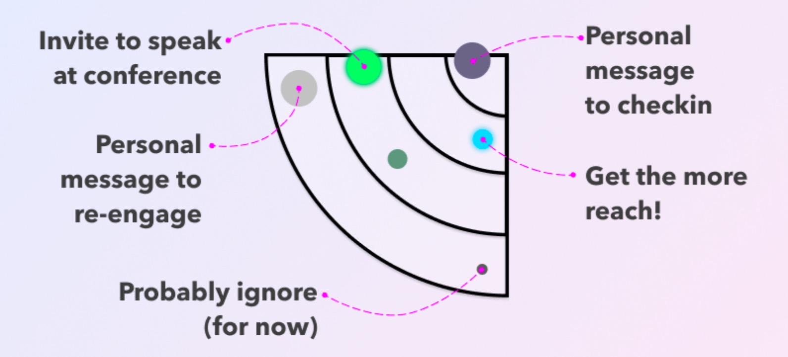
With the plot in hand, it's time to start sketching out some plays.
In Orbit 4, you have a member with high reach and low love, but who has been active recently. There’s also a member with low reach and high love, but whom we haven’t seen in a while.
In Orbit 3, you have a member with very high love and high reach who’s more active than average, as well as a member with average love and reach for their level.
In Orbit 2, you have a member with high love, low reach, and high activity.
And in Orbit 1, you have a member with low reach (relative to their level) and high reach, but not a lot of recent activity.
(🚧 the rest of each play coming soon)